UX Research
User Survey
Tagging Taxonomy
Affinity Map
Insights
UI Design
Information Architecture
User Flows
Low-Fi wireframes
Hi-FI Prototype
Figma
Dovetail
Notion
Photoshop
Overview
Sharing is caring
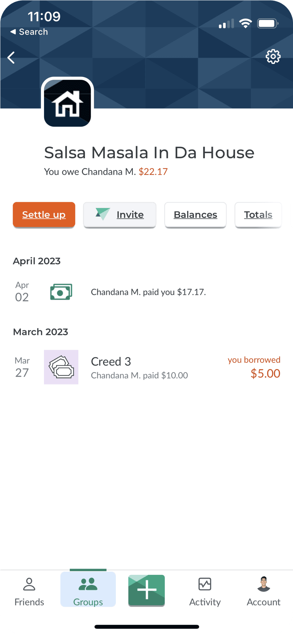
Over the span of a couple of months my partner and I worked on our bootcamp case study for Splitwise, an app designed for sharing expenses among users. Our research phase helped us to grasp the challenges and objectives users faced with the current interface. Upon completing this phase, we decided to work independently on the redesign of the interface.
Solutions
Add features/elements SPECIFIC to the group type
Ability to quickly filter/adjust expense types
Show all expenses, even ones user is not involved in
Show Net total for each expense line item
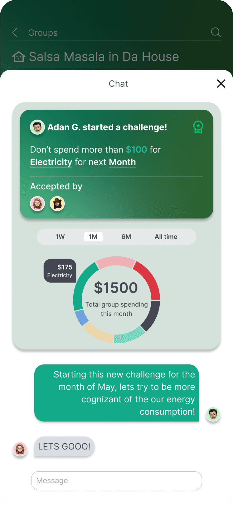
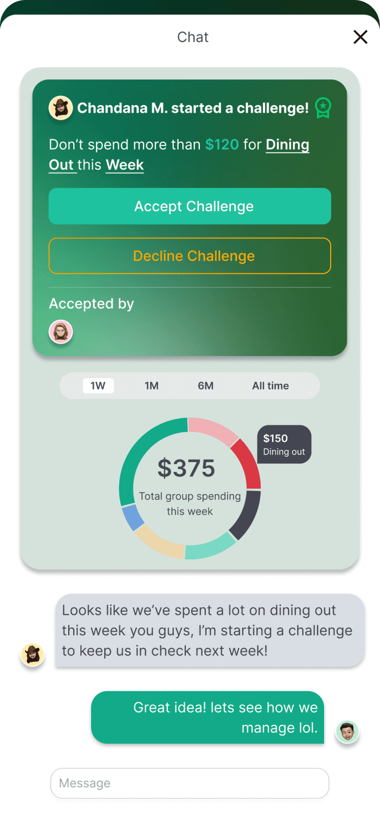
Add challenge feature
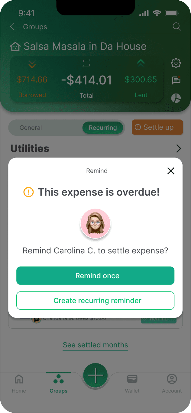
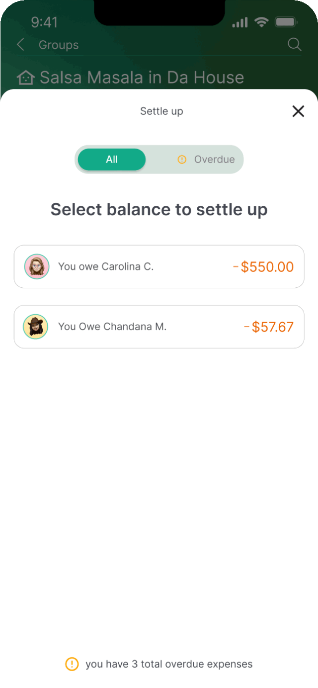
Add warning icon for remind/settle up CTA
Business goals - Enhance user experience
Increase adoption of the paid product be enhancing the user experience: implementing intuitive and transparent features that improve expense categorization, payment tracking, and accurately reflect who has paid for what.
User Segment - Young professionals with roommates
User segment consists of young professionals in their 20s and 30s who share expenses with roommates, friends, or significant others, and are likely to utilize Splitwise's group feature for tracking shared expenses related to rent, groceries, utilities, and other common costs
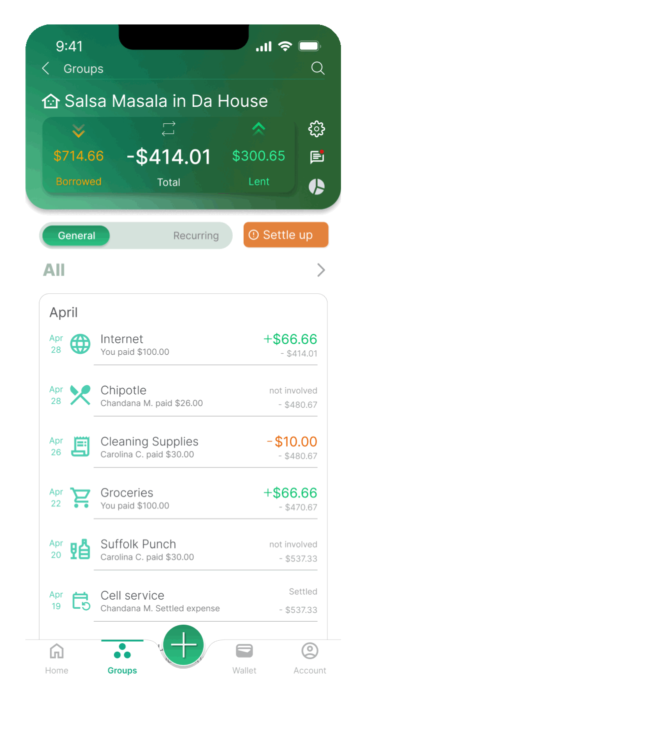
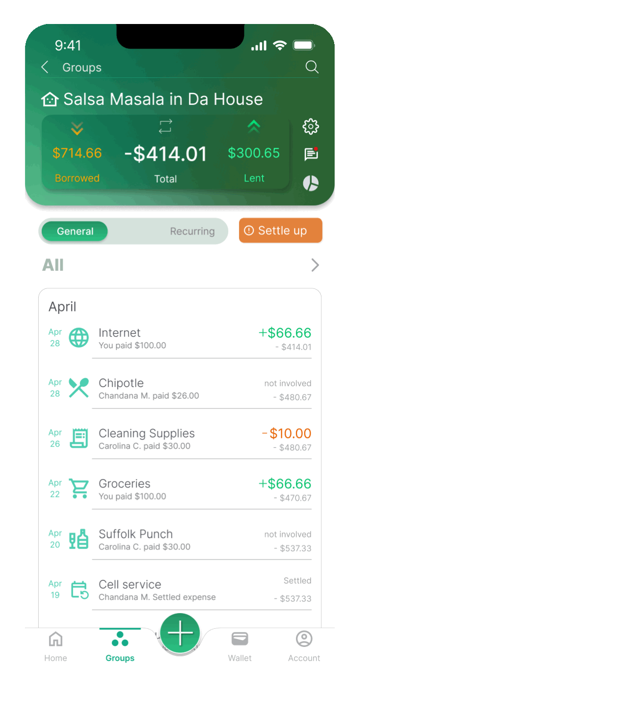
Groups Tab

Roommates Tab
Travel Tab
users vs non-users
survey says!
We began our research by outlining survey questions we believed to be important and relevant to the target user group- 20/30s professionals that use Splitwise. After the general line of questioning was finalized, we began creating the online survey using google forms. The survey was done and we began sending out the link, but there was one small issue…

We immediately discovered that in order to gain better understanding of user needs and behaviors we need to ask everyone within the target user group, including individuals that do not use Splitwise. For the second round of survey questions, we decided to take a step back and began to outline our survey again, but this time taking into consideration users that do not use Splitwise. We created two potential paths a user could take ; YES I track expenses or No I don't track expenses.

Users desire convenience, Transparency, and Accountability
Lets count our money
Now that we have collected all the data, its time to count our findings. We used dovetail to develop our tagging taxonomy and created and affinity map.

To illustrate user habits and tendencies, I designed a pinwheel map, which enables you to observe user trends from the center outwards, with central trends being the most crucial.
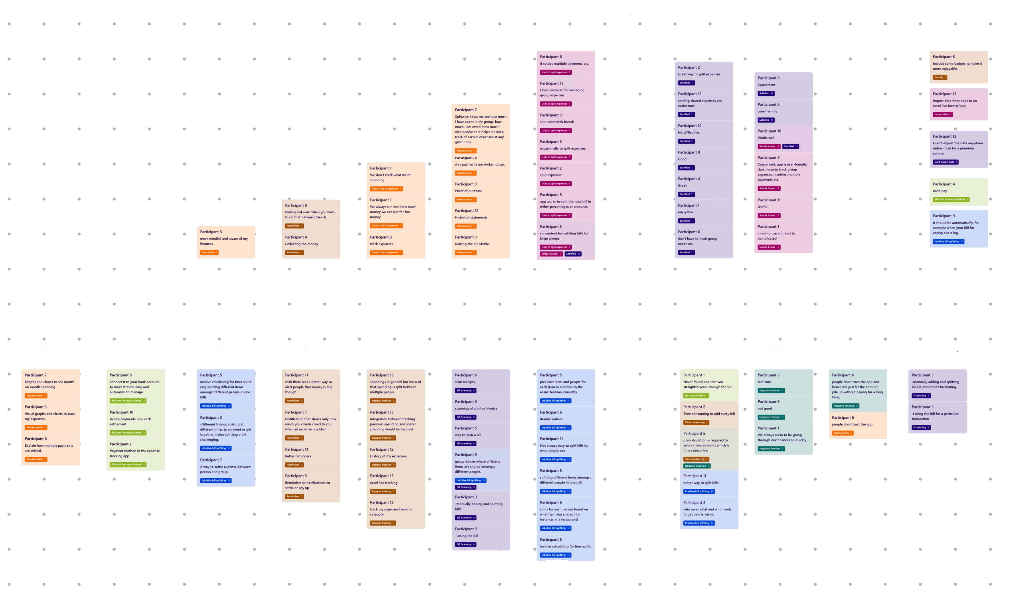
User goals
Conveniently split expenses
keep track of shared expenses
Ability to scan and itemize
Travel
Bills/subscriptions
User pain points
Trust
Accountability
Expense breakdown
Reminders
"Users desire a solution that enables convenient splitting and tracking of shared expenses while fostering transparency and accountability"
giving users what they want
I wireframed various user flows I felt needed refinement based on the overall user responses and insights we developed. I like to iterate when I'm starting this exploration phase of design. This gives me the opportunity to retrace my design thinking anytime I need to reference these sketches. User flows I wireframed include: creating a group, main group tab, group expense, adding expense, adding a member to group, and charts/graphs.

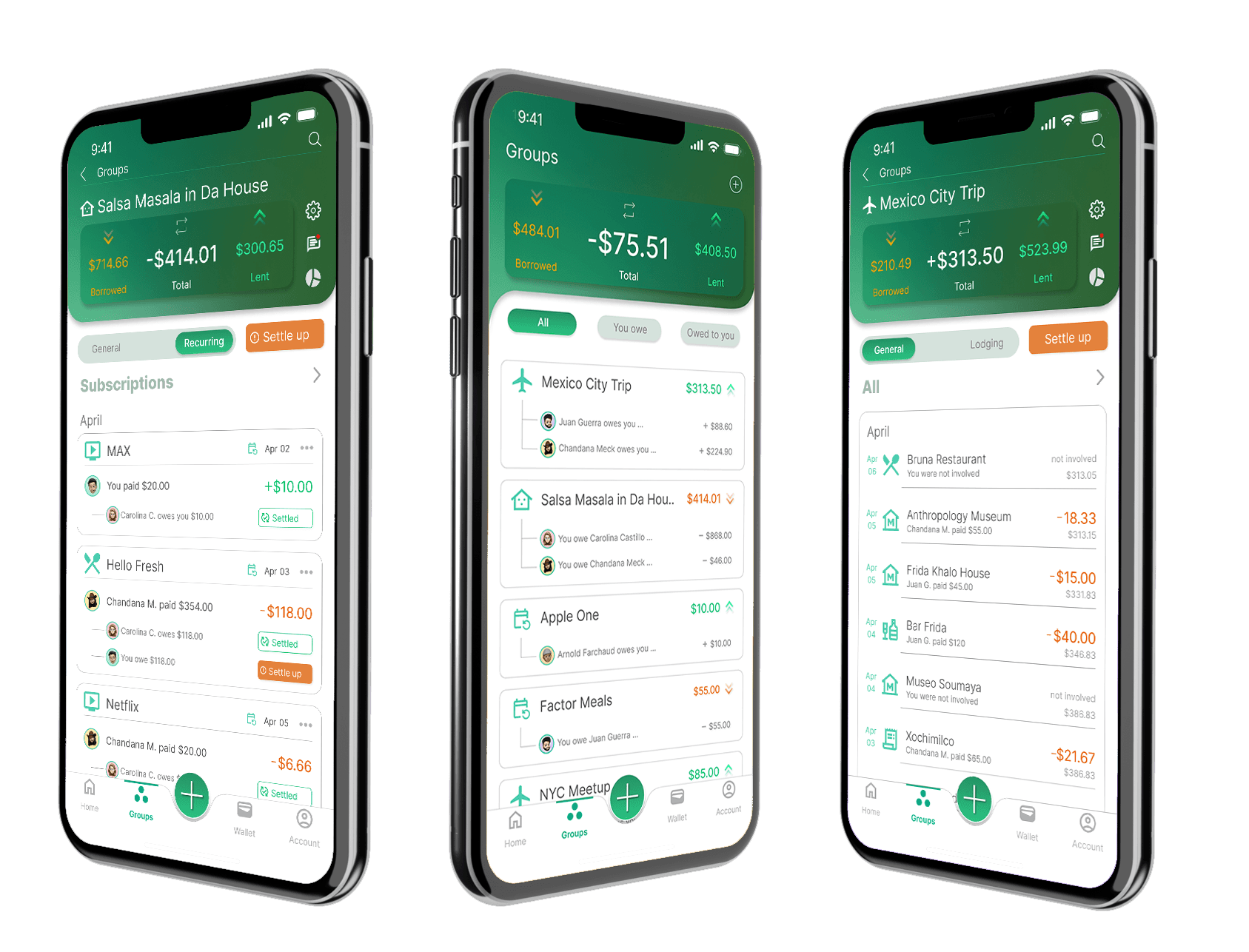
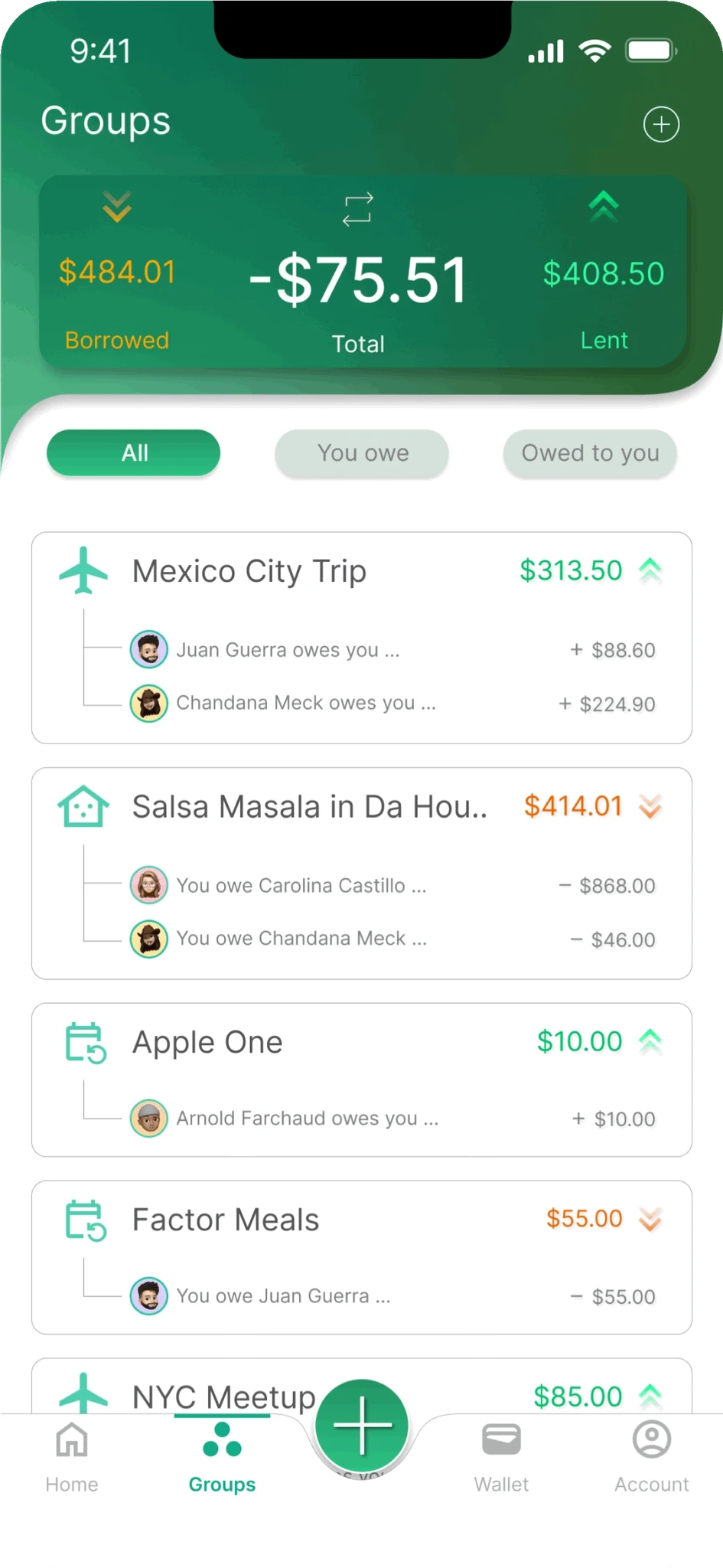
Main Groups tab
Upon deeper examination and to avoid swamping myself with the numerous potential user flow alterations, I focused on two user flows that would effectively address the issue at hand: Main group tab and the subsequent group expense tab. The UI of these user flows held the most potential in terms of fulfilling user goals and easing pain points.
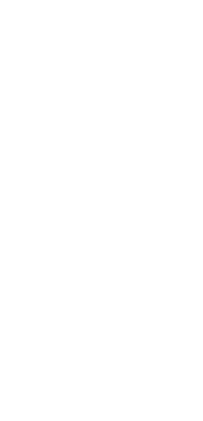
The second user flow I focused on was the group expense tab. In this scenario, I focused on creating two potential group expense types- one for travel and one for roommates.


a new way to split
Convenience
features/elements SPECIFIC to the group type
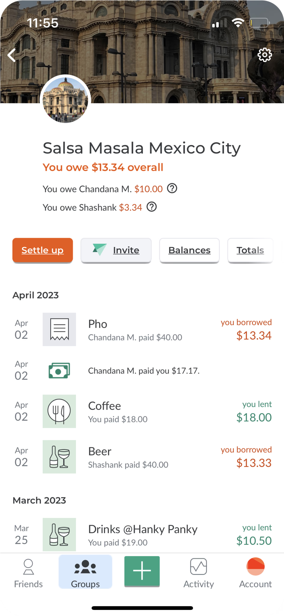
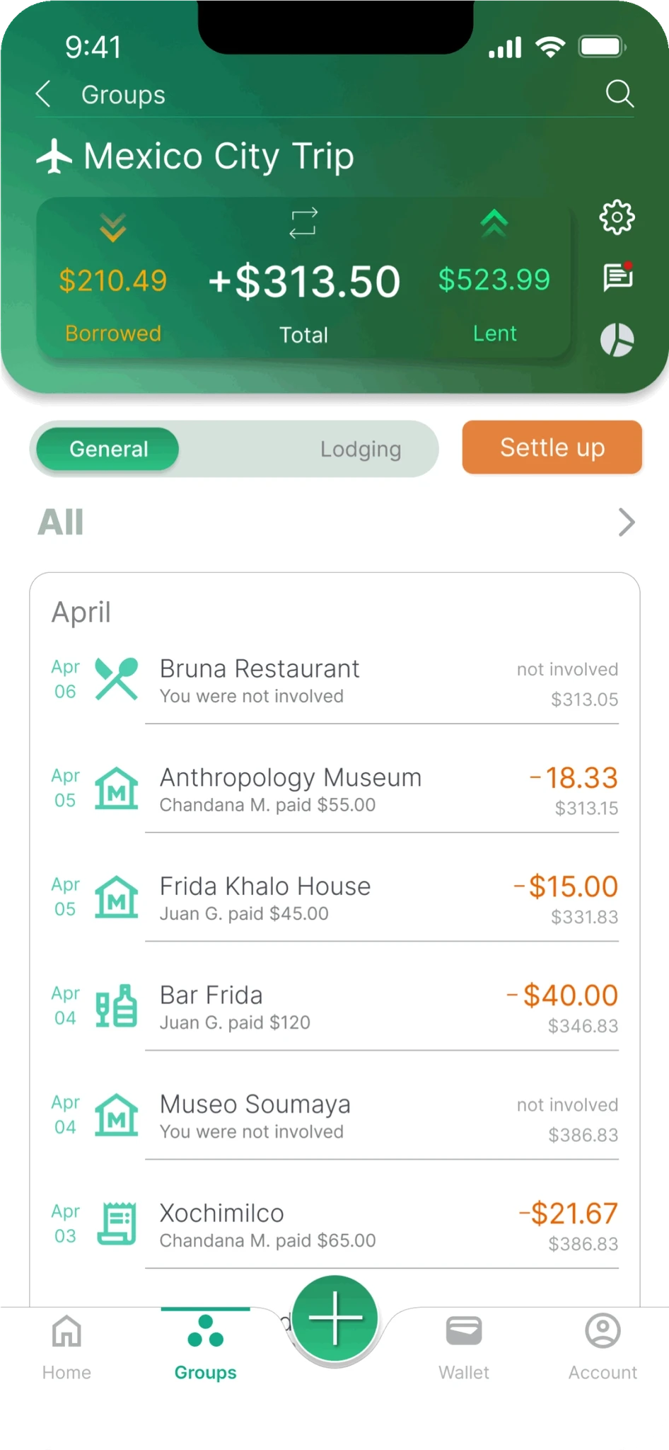
Main Group tab: Show totals in one card; total you owe, total owed to you , and the net total.
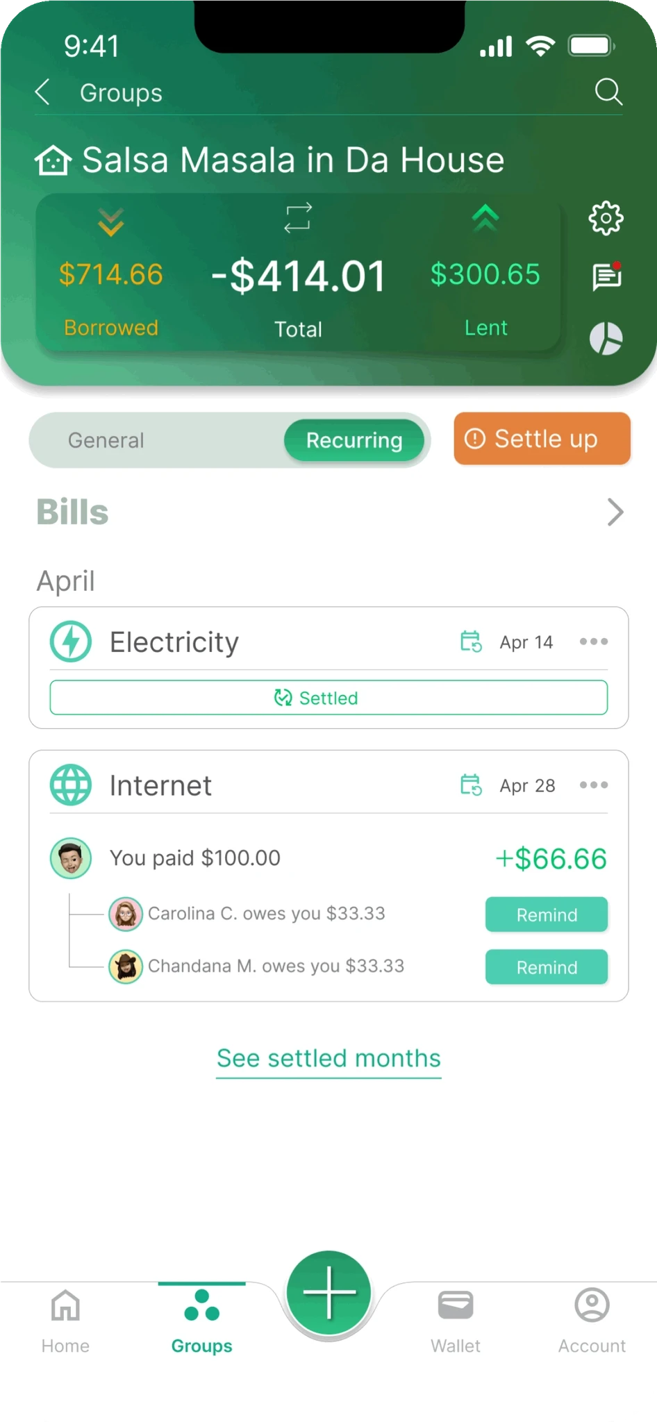
Group Living: General vs recurring expenses.
Travel: general and lodging tabs.
quickly filter/adjust expenses
Main Group Tab: all groups, Groups you owe, Groups owed to you.
Subgroup general tab: all expenses, you lent, you borrowed.
Recurring: Rent, Bills, Utilities, Subscriptions.


Transparency
Show all expenses
Show all expenses within a group, even ones you are not part of. This fosters trust within a group.
Show Net total for each expense
Show your overall group balance for each shared expense line item so you can quickly see how it is adjusting after each expense.
Accountability
challenge feature
Challenge feature fosters participation and engagement.
warning icon for remind/settle up cta
Allows users to see which shared expense requires attention.
Let user know which expense needs to be settled up
Let user knows which expense needs reminding